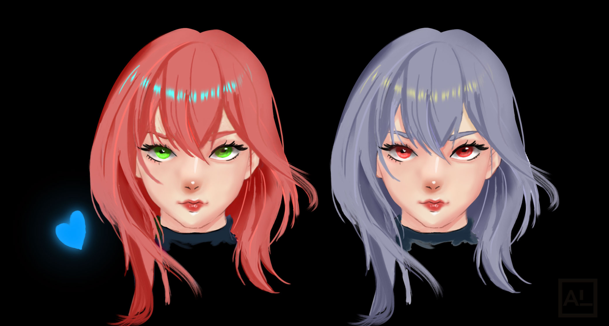
Picking colors shouldn’t feel like a guessing game—but when you’re just getting started with art, it often does. You find yourself stuck between choosing something that looks right and figuring out what actually works. I’ve been there.
This guide breaks down color theory into something practical, not overwhelming. No jargon. No long history lessons. Just the key ideas you can start applying to your work today—whether you’re painting digitally, sketching on paper, or designing characters for your next project.
What Is Color Theory, Really?
Color theory is the study of how colors interact—and how we use them to create harmony, mood, and meaning in art. The foundation of it all? The color wheel. It helps you see which colors work well together and which combinations create contrast or tension.
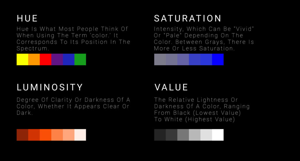
Here are the three basic traits that define every color:
- Hue – The actual color (red, blue, green, etc.)
- Value – How light or dark a color is
- Saturation – How vivid or muted a color is
Together, these give you control over how your art feels. A highly saturated red grabs attention. A low-value blue adds mood. Mastering these basics will help you create color palettes that feel intentional—not random.
Meet the Color Wheel
Think of the color wheel as your map. It shows how different colors relate to each other:
- Primary colors: Red, yellow, blue – can’t be made by mixing
- Secondary colors: Green, orange, purple – made by mixing two primaries
- Tertiary colors: Red-orange, blue-green, etc. – blends of a primary and secondary
Understanding these relationships gives you a strong base for choosing palettes that are balanced, bold, or both.s!
RGB vs. CMYK: What’s the Difference?
As an artist, you’ll eventually work with both screen-based and print-based color models. Here’s the quick breakdown:
- RGB (Red, Green, Blue): Used for digital work—like web, social, or app design. Colors are created by adding light. Combine all three at full strength and you get white.
- CMYK (Cyan, Magenta, Yellow, Black): Used for print. Colors are made by subtracting light from a white surface. Combine them all and you get black (in theory).
TL;DR:
- If you’re working digitally, use RGB
If you’re prepping for print, switch to CMYK to avoid color shifts and surprises
Warm vs. Cool: Why Temperature Matters
Every color leans warm or cool—and that affects the mood of your art.
- Warm colors (reds, oranges, yellows): Feel bold, energetic, intense
- Cool colors (blues, purples, greens): Feel calm, quiet, reflective
Good art often has a mix of both. But here’s the trick: color temperature is relative. A blue may feel warm next to a cooler blue. Always look at colors in context, not in isolation.
Try this: Paint a sunset with soft pinks and oranges, then add a hint of cool blue in the shadows—it instantly balances the heat.

Why Gray Might Be Your Secret Weapon
Gray doesn’t sound exciting, but it’s incredibly useful:
- Makes bright colors pop
- Helps balance a saturated palette
- Adapts based on nearby colors (it can “borrow” hue from what’s around it)
If you’re new to painting, try starting in grayscale. It helps you focus on value before jumping into color—which gives your later work way more depth.
Color Harmonies (and How to Use Them)
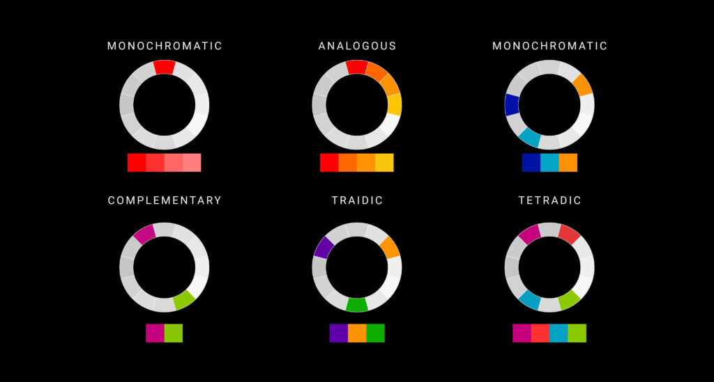
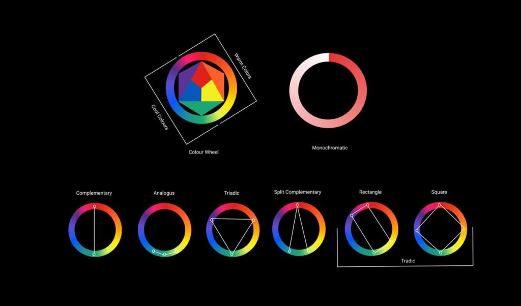
ChColor harmonies are like color combos that just work. They’re based on the relationships between colors on the wheel. Here are a few that beginners often start with:
- Monochromatic – One hue, with different tints/shades
- Complementary – Two colors opposite each other (e.g., red and green)
- Split Complementary – A base color + two neighbors of its opposite
- Analogous – Three colors next to each other (e.g., red, orange, yellow)
- Triadic – Three evenly spaced colors (e.g., red, blue, yellow)
- Tetradic (rectangle) – Two complementary pairs
- Polychromatic – Five or more colors evenly spaced
Want to experiment? Try tools like Adobe Color to generate palettes using any of these harmonies.
Color Context: How Colors Change Based on Surroundings
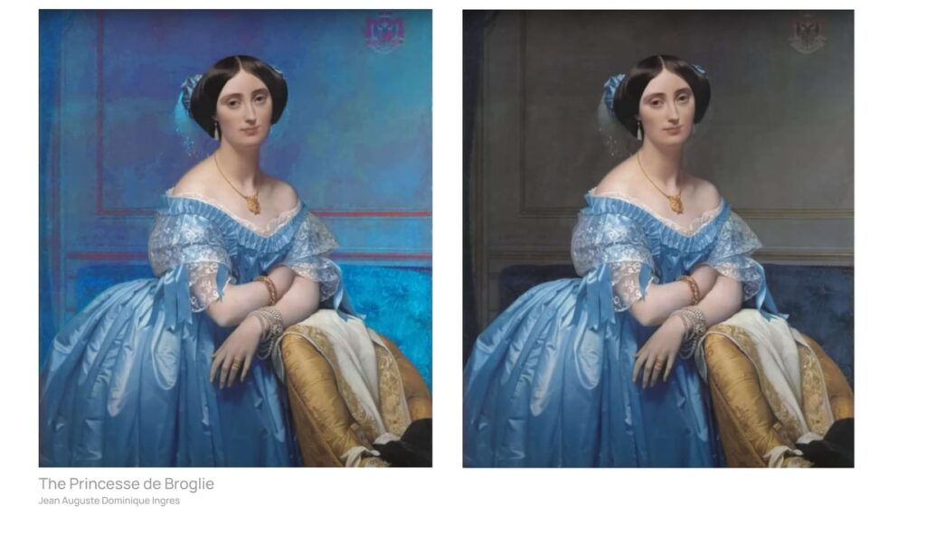
Colors shift depending on what they’re placed next to. A red may look intense next to gray, but dull next to orange. This is called color context, and it’s why you should always test colors inside your actual composition—not just in swatches.
It’s also why color in branding, illustration, and UX design matters so much. A great palette in one context can totally fall flat in another.
Why Color Theory Actually Matters
Color isn’t just about aesthetics. It affects how people feel and interpret your work.
- A well-balanced palette makes a piece feel polished
- High contrast draws attention to your focal point
- Strategic use of warm vs. cool can suggest time of day, emotion, or atmosphere
- Bad color choices? They confuse, overwhelm, or just fall flat
Whether you’re sketching fantasy characters, designing merch, or building an art brand, understanding color gives your work clarity and impact.
Free Tools & Resources to Practice
To help you build confidence with color, check out these free downloads:
✅ Custom digital brush packs
✅ Grayscale-to-color practice files
✅ Printable palettes for mixing practice
✅ Monthly prompt list with palette challenges
You’ll find them all in the resources section of the site.
Final Thoughts
Color theory isn’t about rules—it’s about tools. The more you understand how hue, value, saturation, and harmony work together, the more control you have over your art. It’s not about being perfect—it’s about getting intentional.
So don’t wait until you “feel ready.” Pick a few colors. Try something. Adjust. Learn. Then do it again.
Your next great piece could start with one solid palette.
Discover More Posts
Keep exploring stories, insights, and creative notes from my journey as an artist. Check out the latest blog entries and find topics that inspire your own process.

How to Draw Stunning Anime Clouds
Learn to draw anime-style clouds with this easy, step-by-step cloud tutorial. You’ll pick up tips on shapes, color, and composition—plus get free cloud brushes to use in your own art.
How to Paint Realistic Metal
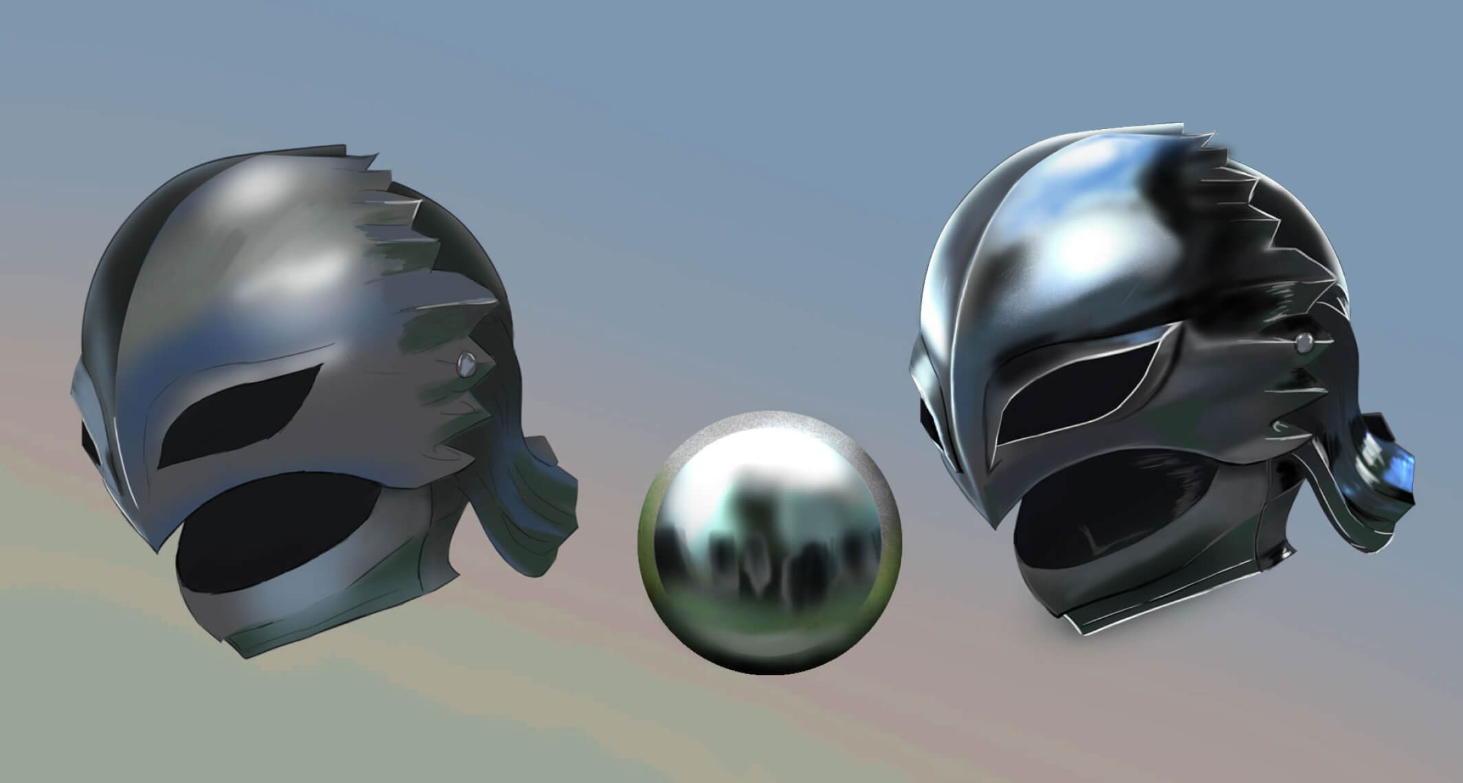
Learn how to paint realistic metal with this step-by-step guide. From base colors to to lighting and reflections, get practical tips for your artwork shine, literally.

Digital Canvas Sizes Made Easy: 6 Smart Tips for Artists
Confused about what canvas size or DPI to use? This beginner-friendly guide breaks down digital canvas sizes, resolution tips, and print dimensions—so you can create with confidence.

