
If you love to draw, paint, or design, you probably started because you wanted to create—not because you wanted to study theory. I felt the same way. For a long time, I thought things like value and space were just for art school students, not people like me. I figured if I had a good sketch, the rest didn’t matter.
But eventually, I learned that fundamentals aren’t a set of rules—they’re tools. The elements of design are what make your artwork. They help it breathe, move, and connect. Once I stopped ignoring them, my work got clearer, stronger, and more intentional.
Here’s how I use them—and how you can too.
The elements of design are the core visual tools every artist works with, whether you realize it or not:
- Line – Movement, direction, energy
- Shape – Structure and layout
- Color – Mood and emotion
- Texture – Realism and surface feel
- Space – Clarity and focus
- Form – Depth and volume
- Value – Light, shadow, and drama
You don’t need to master all of these right away—but knowing they exist gives you more control.
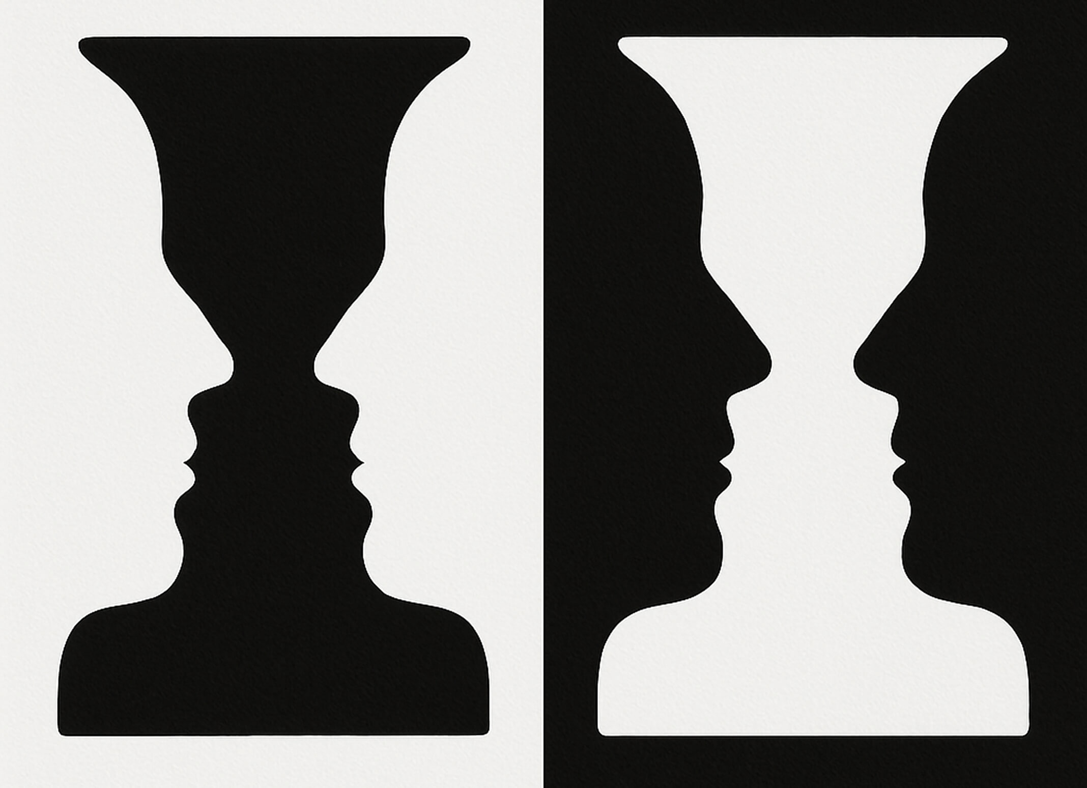
Line: Where the Eye Goes First
Lines do more than outline—they move the viewer’s eye, show direction, and set the tone. Early on, I focused too much on making my lines clean. Then I tried looser, sketchier strokes for a character’s hair and realized it gave the whole piece more energy.
Try this: Draw with a round brush and a loose wrist. Let the lines wobble a little. You’ll start to feel where the rhythm is.
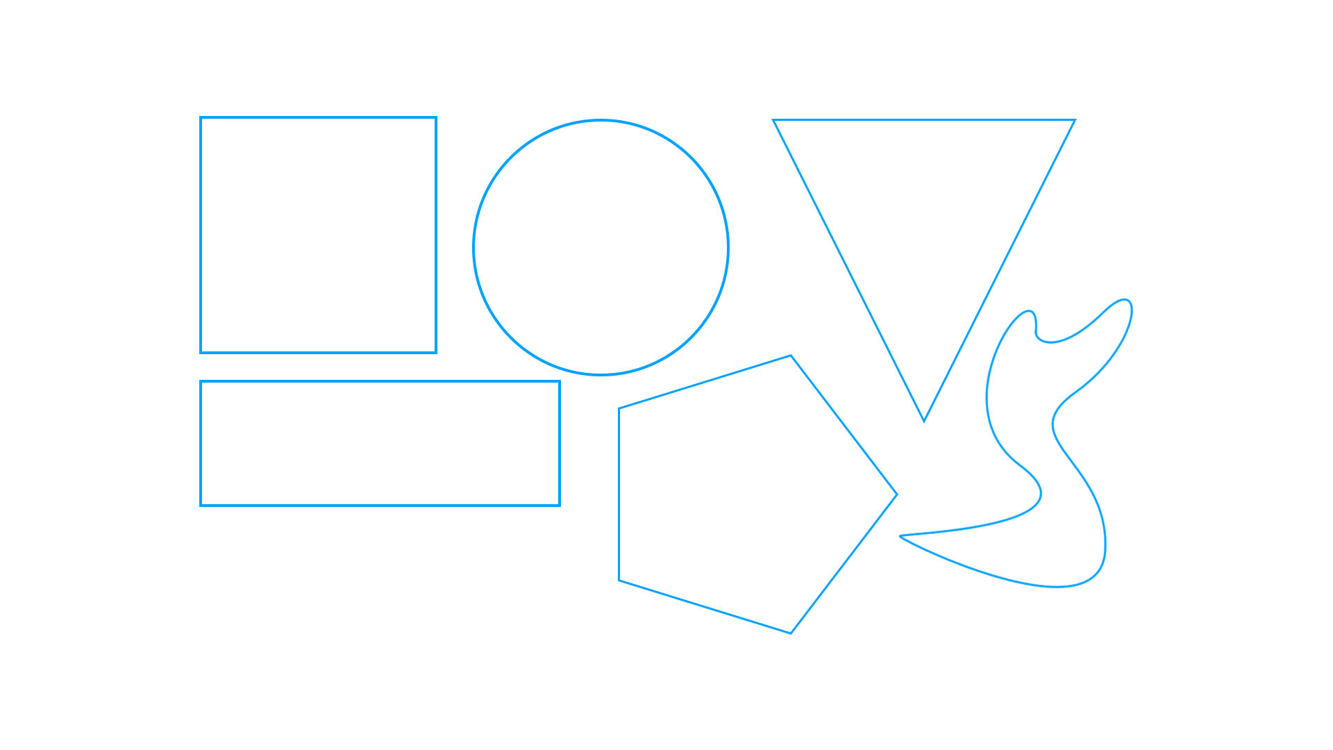
Shape: The Blueprint
Every complex design starts with simple shapes. Circles, triangles, and rectangles are your foundation.
One time I was working on a logo that felt too soft. Swapping circles for sharp triangles instantly gave it a sense of energy. Shapes carry emotion too—use that to your advantage.
Tip: Start every composition by blocking in shapes first. Even for characters. It speeds you up and gives you structure.
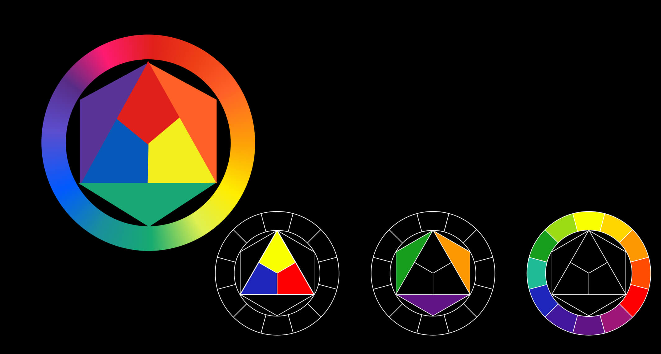
Color: Mood Without Words
Color hits first—it’s what people notice before they see the details.
I once painted a sunset scene using mostly muted purples and oranges. The client liked the layout but said it felt a little heavy. I added a bright yellow accent, and the whole mood shifted—same composition, totally different energy.
A common mistake? Using too many colors. I usually stick to 3–5 per piece: one dominant hue, one supporting color, and a small accent. And before I lock anything in, I always check the values in grayscale to make sure the contrast still works.
If you’re unsure how to build strong palettes, I break it all down in my Color Theory Guide—with tips on hue, value, saturation, and real examples that show how to get the mood just right.
Texture: Make it Feel Real
Texture isn’t just about surface—it’s about giving your work life. I used to pile on textures with no purpose, until someone told me my character looked like a woven rug. Fair. Now I use textures more intentionally—like soft stippling for skin, or photo overlays for worn fabric.
Rule of thumb: If the texture doesn’t add to the mood or realism, leave it out. Use it to enhance, not distract.
Space: The Art of Knowing When to Stop
Space is one of the easiest things to overlook—and one of the most powerful.
Negative space (the empty parts of your composition) gives your work breathing room. It tells the eye where to go. I learned this after cramming too much into a layout and getting feedback that it was “too busy.” Since then, I leave more room around key elements—and my work feels sharper and more confident.
Want proof it works? In one redesign project, just adding more white space around the call-to-action improved clicks by 15%.
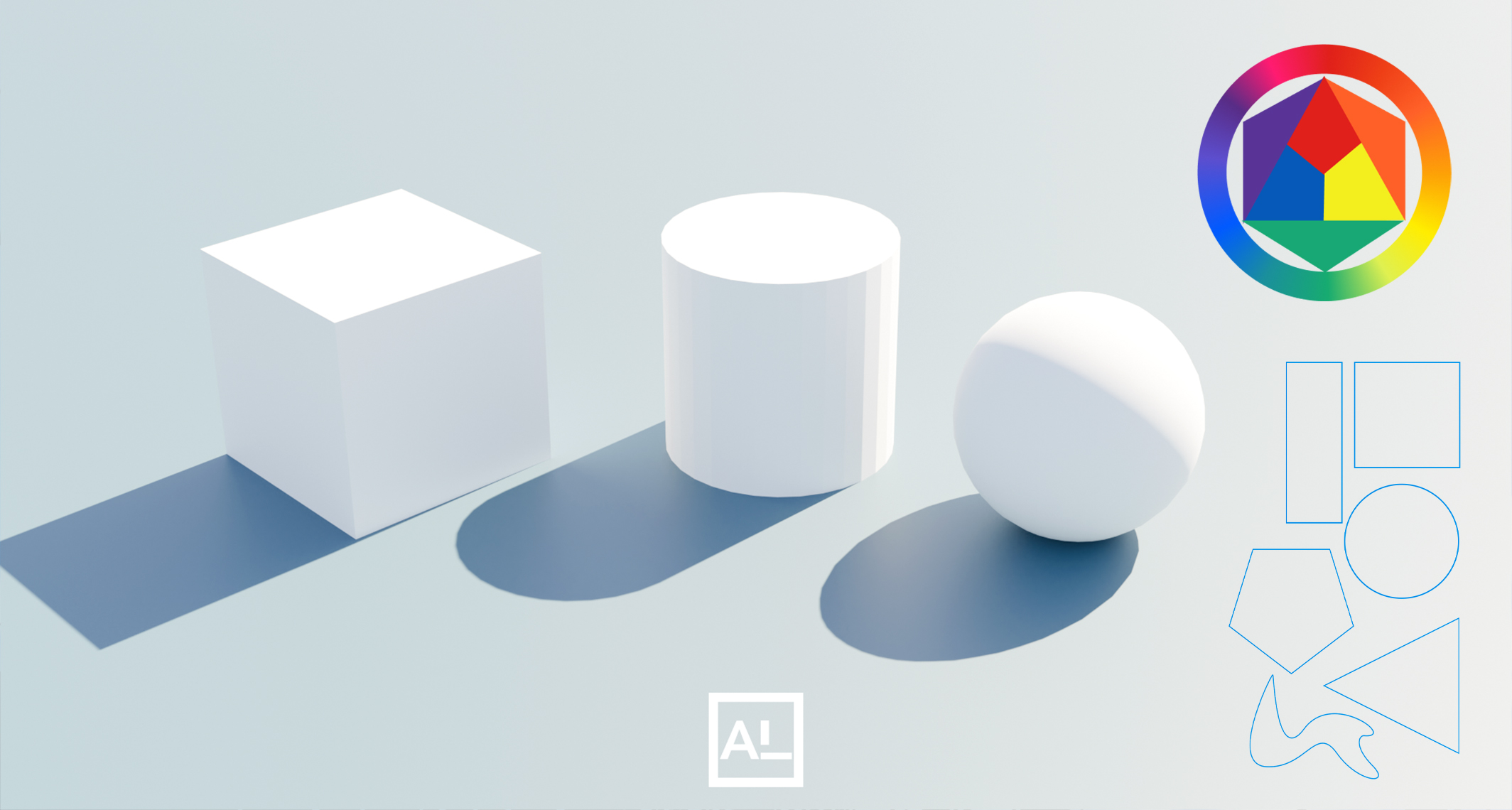
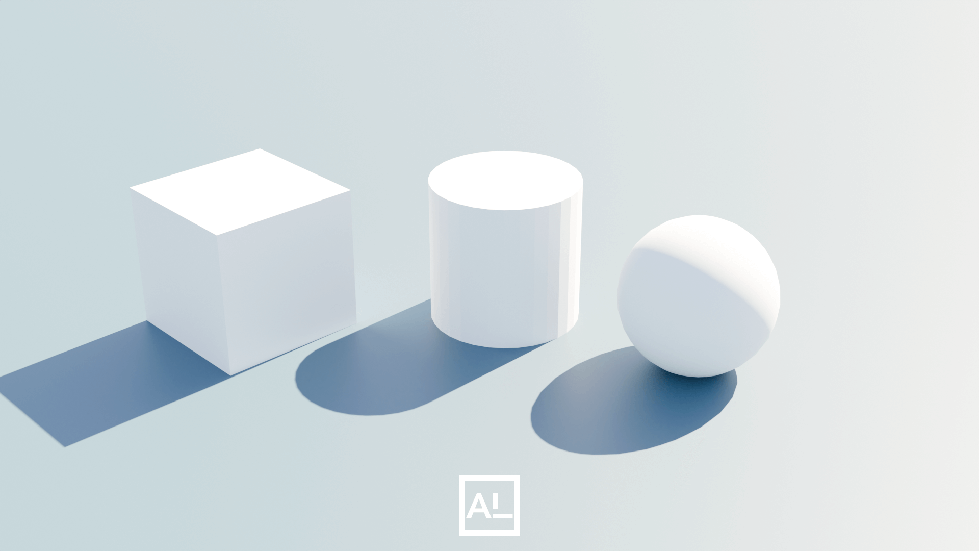
Form: Turning Flat into 3D
Form brings depth to your shapes. It’s what makes a circle into a sphere, or a square into a cube. The secret? Light and shadow.
I used to draw everything super flat. But once I started paying attention to where my light source was, things started clicking. Shadows gave my characters weight. Highlights brought them forward.
Try this: Practice shading basic forms (spheres, cylinders, boxes) from one light direction. It’s boring—but it works.
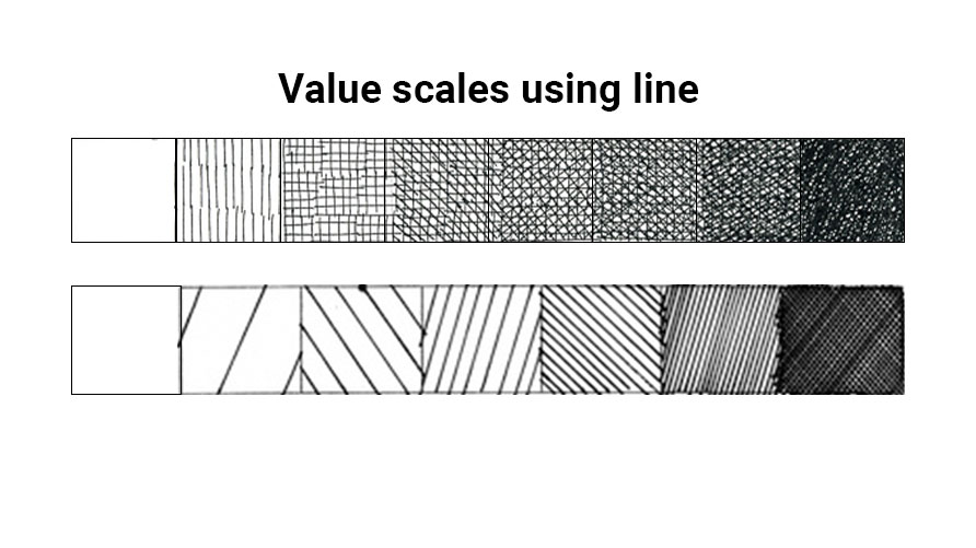
Value: Where the Real Magic Happens
Value—the range from light to dark—is what gives your art contrast, focus, and mood. It’s arguably more important than color. I’ve seen amazing pieces in black and white that feel complete because the value work is solid.
My turning point? Sketching a character in heavy armor. The lines were good, but the piece felt flat—until I added layers of crosshatching to build value. Suddenly, it had weight.
Pro tip: Always check your work in grayscale. If the values are muddy, fix them before adding color. Values tell the story more than color ever could.
Why This Stuff Actually Works
After 10+ years of drawing, I’ve realized that illustration and design aren’t that different. When I design a character, I’m thinking the same way I would about a layout: what’s the focal point? What gets the most contrast? Where should the viewer’s eye go?
Design elements give you structure and rhythm. They help you create art that’s not just impressive—but communicative. Whether it’s a comic page, a logo, or a digital painting, these tools help you make decisions with purpose.
What You Can Do Right Now
Start small. You don’t need to study for weeks. Just try these:
- Sketch with only two line weights
- Block a character using only shapes
- Shade a sphere from one light source
- Build a palette with just 3 colors
- Use hatching to define value (not color)
Test your work in grayscale. Add space where it feels too cluttered. Make one choice at a time—and make it with intention.
Final Thoughts
You don’t need to memorize art theory to make great work. But if you understand the elements of design—and use them with purpose—your art will get stronger, faster. These tools don’t restrict your creativity. They give it structure.
So take them one by one. Practice a little. Apply a lot. And keep making art that feels like you.
Discover More Posts
Keep exploring stories, insights, and creative notes from my journey as an artist. Check out the latest blog entries and find topics that inspire your own process.
How to Draw Stunning Anime Clouds
Learn to draw anime-style clouds with this easy, step-by-step cloud tutorial. You’ll pick up tips on shapes, color, and composition—plus get free cloud brushes to use in your own art.
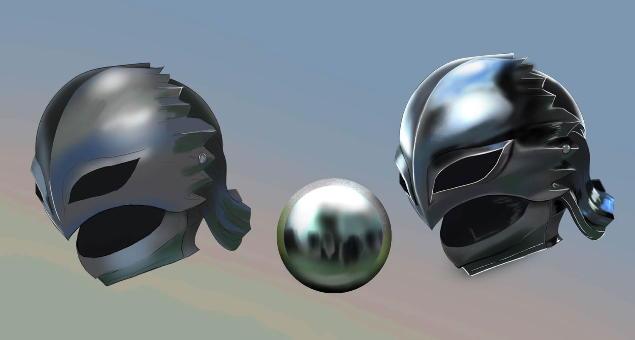
How to Paint Realistic Metal
Learn how to paint realistic metal with this step-by-step guide. From base colors to to lighting and reflections, get practical tips for your artwork shine, literally.
Color Theory Made Simple: A guide for Beginner Artist
New to Digital painting? This beginner-friendly guide breaks down hue, value, saturation, color harmonies, and practical tips to help you choose better palettes and level up your art.